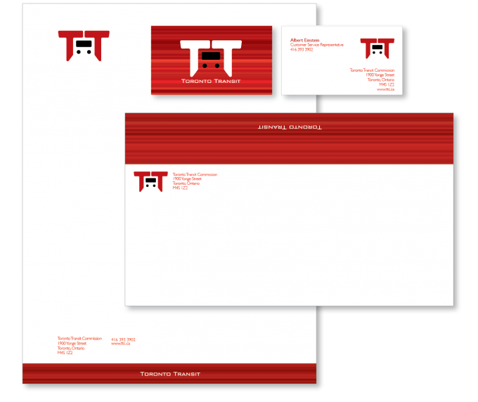
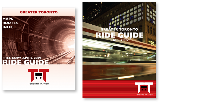
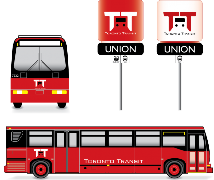
The new logo is a modernize look that is simple and meaningful.
The result are two Ts together with the negative space representing the
front of the vehicle. The slanted ends, symbolizes the lights shining from
the headlights, and this is exactly what you see when the vehicle comes
towards you.
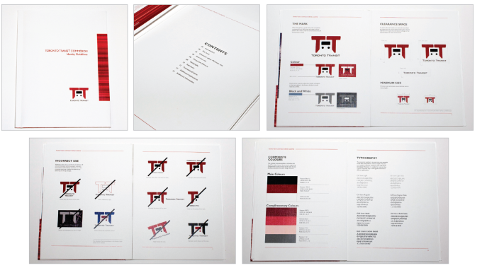
This project received Honorable mention in 2009 RGD Student Awards